

There is something quietly radical happening on British bathroom shelves. The bold, maximalist packaging that dominated the early 2020s, neon type, Instagram-pink tubes, cartoon mascots, is giving way to something far more restrained. Dark amber glass. Sans-serif type in a muted bone or sage. Latin-sounding ingredient names printed in a single-weight font. No fuss, no flourish. The apothecary aesthetic UK wellness brands have adopted is not a trend that snuck up on us; it has been building for several years, and in 2026 it feels genuinely dominant.
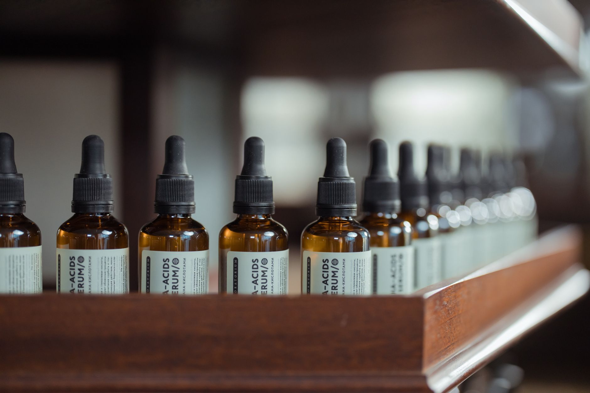
I first noticed it properly on a trip to a north London independent pharmacy-turned-skincare boutique about eighteen months ago. Everything on the shelves looked like it had been dispensed by a Victorian chemist who also happened to have impeccable taste. The bottles were weighty, the labels were spare, and the overall effect was one of profound trustworthiness. I picked up a facial oil I did not need and bought it immediately. The branding did most of the work.
What the apothecary aesthetic actually looks like
If you have been anywhere near a Boots, a Space NK, or a decent independent health food shop recently, you will recognise the visual language instantly. Dark glass vessels, usually in amber, cobalt or frosted clear. Kraft or cream paper labels. Typographic hierarchies that feel almost pharmaceutical in their clarity. Occasional use of botanical line illustrations, the kind you might find in a nineteenth-century herbal compendium. Colour palettes pulled from nature: sage, slate, terracotta, charcoal.
Brands doing this particularly well include Haeckels in Margate, whose packaging looks like it came straight from a Kentish dispensary, and Votary, the London-based facial oil brand that stripped everything back to function and form. Elemis, one of Britain’s best-known premium skincare names, has leaned harder into this visual register over the past two years. Even high street giants like Marks and Spencer’s Apothecary skincare range and Waitrose’s own-label wellness line have adopted the look with considerable commercial success.
Why British consumers are responding so strongly
The timing is not accidental. According to the Office for National Statistics, health and wellbeing have remained among the top consumer spending priorities since 2022, and shoppers are paying closer attention to what they buy and why. Trust has become the currency that matters. The apothecary aesthetic is, at its core, a design language of credibility. It signals heritage, craft, and a kind of scientific seriousness without ever feeling clinical or cold.
There is also a direct relationship between this visual movement and the broader wellness culture shift I have written about elsewhere on this blog. The sober-curious community, for instance, is part of the same wider appetite for intentional living, a rejection of artificial highs in favour of things that feel considered and restorative. When your approach to socialising has become more mindful, it follows that your approach to the products you put on your body becomes equally deliberate.
The trust economy behind minimalist branding
There is a psychological reason this works. Research from the British brand consultancy Wolff Olins suggests that visual simplicity is increasingly read by consumers as a proxy for ingredient honesty. If a brand has nothing to hide behind, the logic goes, it probably has nothing to hide. Less on the label implies confidence in what is actually inside the bottle. It is the same reason that premium supermarket own-brands have moved to clean white packaging with large, clear typography over the past decade.
The apothecary aesthetic UK wellness brands have committed to also speaks to a growing weariness with hype-driven beauty culture. The era of ten-step routines, miracle serums, and celebrity collaboration drops has not disappeared, but it has lost some of its authority. British shoppers are asking sharper questions about what a product actually does. A bottle that looks like it was compounded by a careful herbalist invites that kind of scrutiny rather than deflecting it.
Independent brands have led this charge partly out of necessity. Without large marketing budgets, they have had to earn trust through design and ingredient transparency. Neal’s Yard Remedies, which has been doing this longer than almost anyone, remains a masterclass in how to build a loyal following on the strength of visual coherence and a clear values proposition. Their dark blue bottles are arguably one of the most recognisable design signatures in British wellness.
High street adoption and what it means for indie brands
The interesting tension now is what happens when this aesthetic gets absorbed by mass retail. Once Boots launches another range in amber glass with botanical serif type, does the visual shorthand lose its meaning? I think the answer is more nuanced than the usual “the high street ruined it” narrative. Mass adoption validates the aesthetic’s commercial power, but it also forces genuinely independent brands to push further into craft, provenance, and storytelling to differentiate themselves.
This connects directly to something I find fascinating about how the rural Britain aesthetic in fashion has evolved in a similar direction. Authenticity becomes the differentiator once the visual language itself becomes mainstream. The apothecary look is not enough on its own anymore; it needs a genuine story behind it, a real location, a named herbalist, a verifiable supply chain.
Fragrance, ritual, and the full sensory picture
The apothecary aesthetic has also extended well beyond skincare into fragrance, supplements, and even food products. Independent perfumers like FFERN in Somerset, who operate a small-batch seasonal model, have built cult followings on exactly this combination of visual restraint and origin transparency. Supplement brands are following suit, with names like Bare Biology and Wild Nutrition presenting their products in a way that feels closer to a dispensary than a Holland and Barrett shelf.
What strikes me most is how the full sensory experience has become part of the product. The weight of the glass, the resistance of the dropper, the way the label feels under your thumb. These brands understand that wellness is increasingly about ritual, and ritual requires objects that feel worthy of the moment. It is the same impulse that has made scent a serious self-care category in British wellness culture this year.
What comes next for the aesthetic
My read is that the apothecary aesthetic UK wellness brands have made their own will continue to evolve rather than fade. The next iteration seems to be moving towards even greater specificity: hyper-local botanicals, visible batch numbers, QR codes linking to ingredient provenance, and packaging designed to be genuinely refillable rather than just recyclable. The visual language stays minimal, but the information density behind it increases.
British consumers have become sophisticated enough to want both the calm of a clean label and the reassurance of genuine transparency underneath it. The brands that understand this are not just winning aesthetically. They are building something that lasts.