

Colour drenching has been building quietly in British design circles for a couple of years now, but in 2026 it has genuinely arrived. Walk into any serious interior design studio in London, Edinburgh or Manchester and you’ll find at least one room where the walls, ceiling, architrave, skirting and furniture are all pulled into one commanding hue. Farrow and Ball call it ‘drenching’. Paint brand Little Greene has been championing the idea under different names for even longer. The effect is immersive, a little theatrical and, done well, properly extraordinary.
What interests me is where this trend is landing beyond the living room. The spaces where colour drenching is making the most compelling case for itself are the personal ones: dressing rooms, beauty corners, home wellness areas. The rooms we use to get ready, to decompress, to take care of ourselves. And there’s a real logic to that.
Why colour drenching works so well in personal spaces
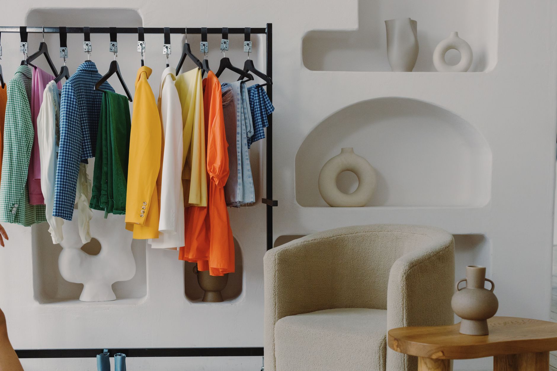
A monochromatic room creates psychological enclosure. It removes visual clutter, because when everything is the same tone, nothing competes for attention. That is exactly what you want in a space designed for self-care or getting dressed with intention. I’ve been in dressing rooms that felt like storage units and ones that felt like actual rituals, and the difference usually comes down to how considered the palette is.
When you drench a small room in a single colour, the dimensions seem to dissolve slightly. A narrow dressing room painted entirely in a warm terracotta, including the ceiling and the inside of the wardrobe doors, stops feeling cramped and starts feeling cocooning. A beauty space wrapped in a deep sage green stops looking like a corner of a bathroom and starts looking like somewhere you’d actually want to spend twenty minutes on your skincare routine.
The British wellness aesthetic has been moving in this direction anyway. As I wrote about recently in the context of alternative wellness rituals and how British women are committing to them, the spaces we use matter as much as the practices themselves. Environment shapes mood. Colour is one of the cheapest and most direct ways to manipulate environment.
The shades British designers are reaching for
Not every colour works equally well when pushed to saturation across an entire room. The ones I keep seeing in wellness and dressing spaces right now fall into a few families.
Deep, dusty greens, the kind that sit somewhere between forest and sage, have been dominant for a while and they’re not going anywhere. They photograph beautifully and have a grounding quality that works for morning routines. Blush and clay tones, closer to terracotta than pink, are being used heavily in beauty spaces because they are genuinely flattering to look at yourself in. And there’s been a resurgence of inky blues and near-blacks for dressing rooms, which sounds counterintuitive but creates the kind of drama that makes you feel like getting dressed is an occasion.
Dulux, whose annual colour forecasting is worth taking seriously, pointed towards warmer, earthier palettes as the direction for 2026 British interiors. Farrow and Ball’s ‘Peignoir’, ‘Mole’s Breath’ and ‘Treron’ have all appeared repeatedly in interiors press features on wellness rooms this year.
How to actually do it without it going wrong
The most common mistake is stopping short. People paint the walls and leave the ceiling white and the skirting gloss-white and the effect looks half-finished rather than considered. True colour drenching means going all in: ceiling, walls, woodwork, the lot. Use the same paint in the same finish for everything, or drop the woodwork one shade darker for depth. Resist the urge to break it up with something contrasting.
Finish matters more than people expect. A chalky, flat emulsion on the walls with a slightly different sheen on the woodwork creates enough subtle variation to keep the room interesting without disrupting the overall effect. High-gloss on everything reads as a nightclub bathroom. Dead flat on everything can feel airless. An eggshell on woodwork, flat emulsion on walls and ceiling is usually the right combination.
Lighting is the thing that makes or breaks colour drenching. Natural light will change the colour dramatically across the day, which is part of the appeal, but your artificial lighting needs to be warm. Cool LED strips will make a terracotta room look orange in the worst possible way. Warm-toned bulbs, positioned at different heights rather than purely overhead, keep the drenched effect looking intentional after dark.
Connecting the aesthetic to how you dress and present yourself
There’s a genuine fashion angle here that goes beyond the surface. A dressing room that has been colour-drenched functions differently to a neutral one. It becomes a backdrop, almost a stage set, and the clothes you hang in it, the accessories you display, read differently against a considered colour. Jewellery tones look more deliberate. The edit feels sharper.
I’d argue this connects to the broader British shift towards intentional dressing, the idea that style isn’t just about what you put on but about the context in which you make those decisions. A chaotic, poorly lit getting-ready space produces a different kind of morning to one where everything feels curated. The environment affects the choices. This is not abstract: it is just true.
The anti-aesthetic aesthetic that’s shaping British fashion right now is partly about resisting the algorithm-flattening of personal style. Giving yourself a physical space that reflects your sensibility, rather than a generic neutral box, is part of the same impulse.
Budget, scale and where to start
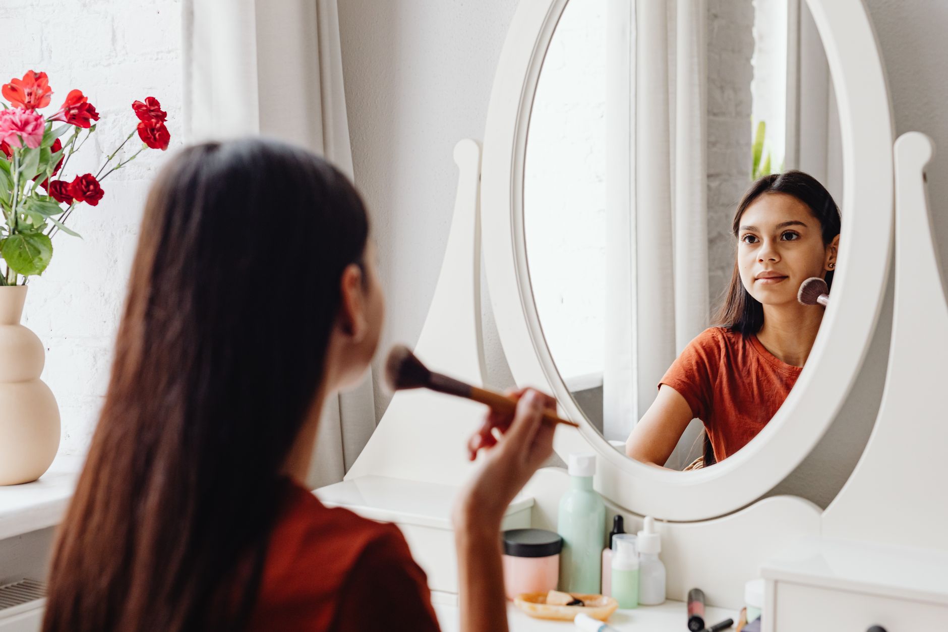
You do not need a dedicated dressing room to try this. A freestanding mirror, a single wall painted from top to bottom in one colour, and a rail or two placed against it is enough to create the effect in a corner of a bedroom. A bathroom shelf used as a beauty space can be transformed by painting the alcove behind it. The principle scales down very well.
In terms of cost, a quality paint in the UK will run you roughly £15 to £25 per litre for a premium brand. A small dressing room or beauty corner rarely requires more than five litres total across all surfaces. That’s a genuinely affordable transformation compared to furniture or lighting changes. The BBC’s home design coverage has consistently highlighted paint as the highest-return-on-investment change you can make to a space, and colour drenching is where that return is most visible.
If you’re thinking about refreshing the broader identity of a personal space, whether that’s through your wellness corner, your digital presence or your wardrobe edit, it’s worth thinking holistically. Brands like dijitul Web Design approach digital spaces with the same intentionality that good interior design brings to physical ones, where colour, coherence and atmosphere all pull together.
For skincare and beauty spaces specifically, the trend links neatly to what’s happening with UK wellness beauty in 2026, where the visual environment around your products is becoming as considered as the products themselves. A colour-drenched beauty corner is, in that context, not an indulgence. It’s a logical extension of the same thinking.
Pick one shade. Commit fully. The transformation is faster than you’d expect and the effect lasts in a way that a new throw or a few candles never quite does.
Frequently Asked Questions
What is colour drenching in interior design?
Colour drenching means painting an entire room, including the walls, ceiling, skirting boards and architrave, in the same single colour or closely related tones. The goal is a fully immersive, monochromatic effect rather than a standard feature wall. It’s been popularised in the UK by paint brands like Farrow and Ball and Little Greene.
Which colours work best for a colour-drenched wellness or dressing room?
Deep dusty greens, warm terracotta and clay tones, and inky near-navy blues are the most widely used in British wellness and dressing spaces right now. Warm, earthy hues tend to photograph well and create a grounding effect, while darker tones add drama that makes a dressing room feel like a considered space rather than storage.
Does colour drenching work in small rooms?
Yes, and it often works better in small rooms than large ones. When every surface is the same tone, the eye stops reading the room as small and starts reading it as cocooning. A narrow dressing room or a compact beauty corner benefits from the effect removing visual interruptions that would otherwise make the space feel cramped.
What paint finish should I use for colour drenching?
A flat or chalky emulsion on walls and ceilings combined with an eggshell on woodwork is the most common and most effective combination. It creates subtle variation in sheen without breaking the monochromatic effect. Avoid high-gloss on all surfaces, as it reads as harsh rather than considered, particularly in smaller rooms.
How much does it cost to colour drench a room in the UK?
For a small dressing room or beauty corner, you’ll typically need around four to five litres of paint across all surfaces. Quality paint from brands like Farrow and Ball or Little Greene costs roughly £15 to £25 per litre, making the total materials cost somewhere between £75 and £125 for a focused personal space. It’s one of the most cost-effective ways to dramatically change a room’s atmosphere.
Leave a Reply