

Something has shifted in the way Britain’s best wellness spaces look and feel. The clinical white shelving, the strip lighting, the laminate counters, they’re not gone everywhere, but in the spaces that actually feel worth visiting, they’ve been quietly replaced by something altogether more atmospheric. Dark-stained oak, amber apothecary bottles lined up like they belong in a Georgian dispensary, brass fittings, handwritten card labels. I’ve noticed it in small independent beauty studios across Manchester and Edinburgh, in the wave of new wellness shops opening on secondary high streets, and in the thoughtful rebrands of indie pharmacy brands that clearly decided that looking like a budget supermarket aisle was no longer good enough. This is the wellness aesthetic UK 2026 is genuinely obsessed with.
What is the apothecary aesthetic and where did it come from?
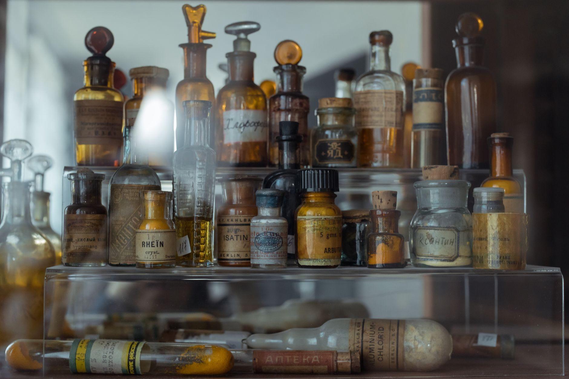
The apothecary aesthetic draws from Britain’s own pharmaceutical and herbalist heritage. Victorian apothecaries were sensory spaces: glass-fronted cabinets, dark mahogany counters, the smell of dried herbs and tinctures, handwritten Latin labels on earthenware pots. They felt serious and trustworthy because of how they looked, not despite it. For decades, the wellness and beauty industry moved in the opposite direction, chasing the clean white clinical palette associated with science and hygiene. Now the wheel has turned.
Part of the credit goes to the broader shift in what British consumers actually want from a wellness purchase. Buying a serum or a supplement has become an experience, not a transaction. People want to feel something in the shop. They want texture, warmth, and the quiet authority of a space that feels like it has history. Brands and interior designers have clearly received that message. According to the Mintel UK beauty and personal care reports, experiential retail is now a primary driver of in-store footfall among 25 to 44-year-olds. The apothecary aesthetic happens to deliver exactly that.
The materials that define the look in 2026
If you want to spot the trend in the wild, look for a few key material signatures. Dark wood is everywhere, usually in walnut or smoked oak. It’s used for shelving, counters and display units, and the grain is always visible, always tactile. No one is painting it. The glass is amber or dark green, used for product bottles, pendant light shades, and display cabinets. Brass hardware ties it together: drawer handles, tap fittings in treatment rooms, light fittings with an industrial edge that somehow also reads Victorian.
The product display itself is part of the aesthetic. Artisan shelving with generous negative space, small ceramic or stone bowls holding samples, dried botanicals hanging from hooks. Nothing is crammed in. The visual editing is deliberate, which creates the impression that every item on the shelf has been curated, not just stocked. That’s a powerful psychological cue for a customer deciding whether to trust a £38 face oil from a brand they’ve never heard of.
I’d argue the lighting is doing the heaviest lifting here. Warm Edison-bulb pendants, directional spotlights in deep amber tones, and the occasional candle on a treatment room counter all work against the nervous overhead fluorescence that ruins the mood in lesser spaces. Light this warm makes every product look more luxurious. It makes skin look better during consultations. It slows people down.
Independent pharmacies and beauty studios leading the shift
It’s not luxury brands doing this exclusively. Some of the most committed examples of the wellness aesthetic UK 2026 is producing are in independent pharmacies that have been quietly redesigning their interiors to feel less like an NHS dispensary and more like a considered specialist. A few have gone full apothecary: dark wood dispensary counters, amber glass jars, a curated herbal supplement wall. The effect is striking. You trust the recommendation more. You stay longer. You spend more.
Independent beauty studios have been faster still. In cities like Bristol, Leeds and Glasgow, small studios are pairing this aesthetic with genuinely specialist skincare knowledge, which creates an offer that no high-street chain can easily replicate. You walk into a space that smells of essential oils, where the shelving looks like it belongs in a 19th-century pharmacy, and where the person behind the counter can actually explain the difference between bakuchiol and retinol in plain English. That combination is compelling.
This connects to something I wrote about a while back on the broader rise of the British apothecary aesthetic in wellness branding, the packaging revolution that preceded the interior design revolution. Brands got the bottles right first. Now the spaces are catching up.
Why it works as a retail strategy, not just a design trend
There’s a commercial logic underneath the aesthetic. British wellness shoppers in 2026 are more sceptical than they’ve ever been. They’ve absorbed enough content about greenwashing and performative clean beauty to distrust slick white packaging with bold claims. An apothecary-style interior signals something different: slowness, specificity, craft. It’s a visual argument for taking the products seriously.
That said, the aesthetic only works when the offer backs it up. A beautifully curated walnut shelving unit filled with undifferentiated high-street stock reads as theatre, not credibility. The spaces doing this well understand that the interior design is a promise the product range has to keep. Where it lands, it creates the kind of loyalty that performance marketing can’t buy.
The trend also connects to a wider cultural mood around wellness that I’d describe as a move from optimisation towards grounding. People aren’t just looking for the most efficient supplement stack. They want ritual, atmosphere, and a reason to be present. The apothecary aesthetic is essentially a stage set for that kind of shopping. If you’ve been following how traditional skincare ingredients are making a comeback in British beauty culture, this interior trend is the physical space version of the same impulse.
How to read the trend if you’re building or redesigning a wellness space
For anyone actually specifying an interior or planning a shop fit, a few practical notes. The materials cost more upfront than MDF and white paint, but they last longer and wear better. Walnut shelving doesn’t look tired after eighteen months the way a glossy white unit does. Amber glass is more affordable than most people expect because it’s a standard pharmacy bottle format. The lighting investment is non-negotiable, cheap warm bulbs in the wrong fitting will just look grimy rather than atmospheric.
The curation discipline is harder than the materials budget. Editing your display down to what feels purposeful rather than crammed is a skill, and it requires resisting the impulse to use every shelf. Leave space. Let products breathe. The restraint is what communicates quality.
And think about scent. The original Victorian apothecary was an olfactory experience as much as a visual one. Dried lavender, beeswax, botanical extracts. A wellness space that smells right before a customer has picked anything up is already doing a significant amount of the persuasion work. For anyone thinking about how scent fits into a broader wellness brand strategy, the shift in how British people socialise around wellness gives some useful context about what that audience actually wants from a shared experience now.
The wellness aesthetic UK 2026 is producing is not a nostalgia project. It’s a considered response to what British consumers actually trust. Dark wood, amber glass, and genuine expertise dressed in a space that feels earned. That’s a harder thing to fake than a white wall and a logo.
Frequently Asked Questions
What is the apothecary aesthetic in wellness retail?
It refers to interior design choices that draw on Victorian pharmacy styling: dark wood shelving, amber glass bottles, brass fittings, warm lighting and carefully curated product displays. The aim is to create a sensory, trustworthy shopping environment that feels considered rather than clinical.
Why are UK wellness brands moving away from clean white interiors?
Consumer research consistently shows that British shoppers are increasingly sceptical of purely clinical aesthetics, associating them with mass-market products rather than specialist expertise. The moody apothecary look signals craft, curation and slower retail, which resonates strongly with the wellness buyer in 2026.
Which UK cities are leading this interior design trend in wellness spaces?
Independent beauty studios and wellness shops in Bristol, Edinburgh, Leeds, Manchester and Glasgow have been among the earliest adopters. Secondary high streets in these cities have seen a notable uptick in apothecary-style fit-outs alongside the broader independent wellness retail boom.
Is the apothecary interior trend expensive to implement?
The upfront materials cost is higher than standard white retail fit-outs, but solid wood shelving and amber glass are durable and age well. The biggest investment is often in lighting, which transforms the atmosphere entirely. Many studios achieve the look at a reasonable budget by focusing on two or three key material choices rather than a full bespoke fit-out.
Does the apothecary aesthetic work for online wellness brands too?
Absolutely. Many UK wellness brands that sell primarily online use the apothecary visual language through their product photography, packaging and website design. Amber glass, dark backgrounds, botanical props and warm-toned photography all translate the in-store atmosphere into a digital context effectively.